
More actions
There exists no single agreed-upon Jenny Everywhere Logo. Many works and websites dealing with the Shifter have created their own logos across the years, whose purposes and copyright statuses vary.
History
Fes Works logo (2007)
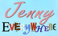
When The Shifter Archive was established around 2007, Fes Works had a formal Jenny Everywhere logo created. It presents the name ‘Jenny Everywhere’ in bright yellow capital letters with a black outline, underlined by arrows. The version used as a header for the Archive also included the words “The Shifter Archive” (in black outlined with white) and a smaller note in white Comic Sans, reading “Jenny Everywhere… in one place!”, and was encased in a rectangle with a dotted borner alternating between black and white, echoing the chessboard tiles of the website's background.
This logo was noted to be “Trademark & © of The Shifter Archive and Fesworks, LCC” in the site description.
Separated from the ‘Shifter Archive’ part, this Jenny Everywhere logo was used in some later works, including COMIC: Jenny Everywhere Meets The Crew Of The Copper-Colored Cupids.
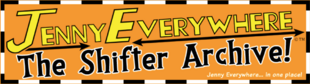
Full Shifter Archive logo.

Clean “Jenny Everywhere” from the Shifter Archive logo.
Jeff Powell logos (2008)
As part of the collaborative project COMIC: When Casting Calls, professional designer Jeff Powell created a Jenny Everywhere logo whose capital letters themselves spun off into arrows. A black and an orange variation of this logo were put up on his website by Powell, although the orange one was the one used on the eventual cover of the comic. The copyright status of these logos is unclear.

Black variant.

Pink/orange variant.
Jenny Everywhere Day logos (2009, 2011, 2013)
The logo used by the Jenny Everywhere Day website contains a stylised “S” depicted by Jenny Everywhere's scarf, as well as the shadowed face of the Shifter herself. Also included are the words “Jenny Everywhere Day”, written in the commercial font Hamburger Heaven NF Pr.
The variant used in 2009 and 2010 was blue. It was replaced in 2011 with a white and gray variant, an evolution of which was then created in 2013, remaining in use until today.
The “Jenny Everywhere” of this logo was sampled for the first logo of our Jenny Everywhere Wiki. However, it must be noted that the copyright status of the “S” art is uncertain, and that use of Hamburger Heaven NF Pr in commercial works requires the paying of a licensing fee.

2009 ‘blue’ variant.

Clean “Jenny Everywhere” from the 2009 variant.

2011 ‘white and gray’ variant.

2013 ‘white and gray’ variant.

Clean “Jenny Everywhere” from the 2013 variant.

Logo of this Wiki.


Matt Sutton logo (2010)
An original logo was used by Matt Sutton on the cover of Jenny Everywhere: The Case of the Dark Bishop. It was black, with ‘Jenny’ written in the font Horizon Std Regular (with an enlarged ‘J’) while the ‘Everywhere’ was made ‘wobbly’ to add a touch of whimsy. This logo presumably belongs to Sutton.

Clean “Jenny Everywhere”.
Craig Oxbrow logo (2011)
For his 2011 contribution to Jenny Everywhere Day, designed as a mock comic-book cover, Craig Oxbrow created a unique Jenny Everywhere logo. While the ‘Jenny’ was given in a pinkish cursive, the ‘Everywhere’ was a mishmash of wildly different letters, each taken from the logo of a preexisting franchise, thus highlighting Jenny's multi-dimensional nature.
For example, the “Y” in “Everywhere” was visibly taken from the Buffy and the Vampire Slayer logo. The copyright status of this logo is thus doubly dubious, first because Oxbrow presumably retains ownership of it, and secondly owing to the lifting of ‘scraps’ of existing trademarks in its creation, which may or may not support its use in commercially distributed works.
The Craig Oxbrow logo.
Gallery

2007
-
2008
-
2008

2009

2010
-
2011

2013