Jenny Everywhere Logo: Difference between revisions
Drleevezan (talk | contribs) No edit summary |
|||
| Line 50: | Line 50: | ||
2013 Jenny Everywhere Day Logo.png|2013 ‘white and gray’ variant. | 2013 Jenny Everywhere Day Logo.png|2013 ‘white and gray’ variant. | ||
Jenny Everywhere Hamburg Logo.png||Clean “Jenny Everywhere” from the 2013 variant. | Jenny Everywhere Hamburg Logo.png||Clean “Jenny Everywhere” from the 2013 variant. | ||
Wiki-wordmark.png| | Wiki-wordmark.png|Original logo of this Wiki. (2020-2024) | ||
Timeless wordmark small.png|Current logo of this Wiki. (2024-present) | |||
</gallery> | </gallery> | ||
Latest revision as of 12:36, 13 August 2024
There exists no single agreed-upon Jenny Everywhere Logo. Many works and websites dealing with the Shifter have created their own logos across the years, whose purposes and copyright statuses vary.
History
Fes Works logo (2007)
When The Shifter Archive was established around 2007, Fes Works had a formal Jenny Everywhere logo created. It presents the name ‘Jenny Everywhere’ in bright yellow capital letters with a black outline, underlined by arrows. The version used as a header for the Archive also included the words “The Shifter Archive” (in black outlined with white) and a smaller note in white Comic Sans, reading “Jenny Everywhere… in one place!”, and was encased in a rectangle with a dotted borner alternating between black and white, echoing the chessboard tiles of the website's background.
This logo was noted to be “Trademark & © of The Shifter Archive and Fesworks, LCC” in the site description.[1]
Separated from the ‘Shifter Archive’ part, this Jenny Everywhere logo was used in some later works, including COMIC: Jenny Everywhere Meets The Crew Of The Copper-Colored Cupids (2020) and Jenny Everywhere and the Master of Monsters (2022).
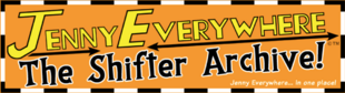
Full Shifter Archive logo.

Clean “Jenny Everywhere” from the Shifter Archive logo.
Jeff Powell logos (2008)
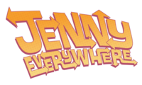
As part of the collaborative project COMIC: When Casting Calls, professional designer Jeff Powell created a Jenny Everywhere logo whose capital letters themselves spun off into arrows. A black and an orange variation of this logo were put up on his website by Powell, although the orange one was the one used on the eventual cover of the comic. The copyright status of these logos is unclear.

Black variant.
Pink/orange variant.
Nigel Palmer logo (2009)
The cover of Nigel Palmer's iconic 2009 comic story COMIC: Jenny Everywhere, Signing Off, as well as its first actual page, used a unique Jenny Everywhere logo, in plain black. The blurb on the first page of the story stated that the fonts used in the comic were acquired on the website Blambot. It is unclear whether this included the title font; efforts to match it to any of the design fonts availabe on Blambot as of 2021 were unsuccessful, although it is probable that the line-up had changed in the intervening twelve years. The logo is, at any rate, presumably owned by Palmer.

Clean “Jenny Everywhere”.
Marc Lapierre logo (2009)
Marc Lapierre's 2009 Jenny Everywhere Day story COMIC: Jenny Everywhere Took My Breath Away used a unique Jenny Everywhere logo, white with black outlines, in a cursive font. Atypically, it included an exclamation mark.

Clean “Jenny Everywhere!”.
Jenny Everywhere Day logos (2009, 2011, 2013)
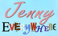
The logo used by the Jenny Everywhere Day website contains a stylised “S” depicted by Jenny Everywhere's scarf, as well as the shadowed face of the Shifter herself. Also included are the words “Jenny Everywhere Day”, written in the commercial font Hamburger Heaven NF Pr.
The variant used in 2009 and 2010 was blue. It was replaced in 2011 with a white and gray variant, an evolution of which was then created in 2013, remaining in use until today.[2]
The “Jenny Everywhere” of this logo was sampled for the first logo of our Jenny Everywhere Wiki, and independently recreated by Scott Sanford for most of his Jenny Everywhere stories starting with Pit Stop. However, it must be noted that the copyright status of the “S” art is uncertain, and that use of Hamburger Heaven NF Pr in commercial works requires the paying of a licensing fee.

2009 ‘blue’ variant.

Clean “Jenny Everywhere” from the 2009 variant.

2011 ‘white and gray’ variant.

2013 ‘white and gray’ variant.

Clean “Jenny Everywhere” from the 2013 variant.

Original logo of this Wiki. (2020-2024)

Current logo of this Wiki. (2024-present)


Matt Sutton logo (2010)
An original logo was used by Matt Sutton on the cover of Jenny Everywhere: The Case of the Dark Bishop. It was black, with ‘Jenny’ written in the font Horizon Std Regular (with an enlarged ‘J’) while the ‘Everywhere’ was made ‘wobbly’ to add a touch of whimsy. This logo presumably belongs to Sutton.

Clean “Jenny Everywhere”.
Craig Oxbrow logo (2011)
For his 2011 contribution to Jenny Everywhere Day, designed as a mock comic-book cover, Craig Oxbrow created a unique Jenny Everywhere logo. While the ‘Jenny’ was given in a pinkish cursive, the ‘Everywhere’ was a mishmash of wildly different letters, each taken from the logo of a preexisting franchise, thus highlighting Jenny's multi-dimensional nature.
For example, the “Y” in “Everywhere” was visibly taken from the Buffy and the Vampire Slayer logo. The copyright status of this logo is thus doubly dubious, first because Oxbrow presumably retains ownership of it, and secondly owing to the lifting of ‘scraps’ of existing trademarks in its creation, which may or may not support its use in commercially distributed works.
The Craig Oxbrow logo.
Ask Jenny logo (2012)
This logo and art was made for the Ask Jenny Tumblr ask-blog, created by Zack Holmes. It featured his default Jenny.

Ask Jenny

Roleplaying Game logo (2017)
The cover of the 2017 Jenny Everywhere Roleplaying Game (developed primarily by Benj Christensen) featured a new Jenny Everywhere logo. Written in the commercial Liquorstore 3D font, it appeared in white with a faint drop-shadow.

The Roleplaying Game logo.
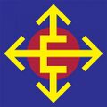
Bobby Campbell logo (2021)
This logo was created by Bobby Campbell as a 2021 contribution to Jenny Everywhere Day, and was released as a 'copyleft' creation, available for use by anyone. The logo consists of the letter 'E', lengthening into arrows which point in all four directions, atop a circle on a solid background. The version of the logo used as an example on the post announcing its release featured a yellow 'E', a red circle, and a blue background, and this was also the version available for download as a .PSD, .AI, and .EPS file, while the version available for download as a .PNG instead featured a blue 'E', red circle, and a transparent background. Additionally, the announcement post featured a piece of Jenny art by Campbell which also utilised a version of the logo, this time with a white 'E', teal circle, and no background - and also depicted Jenny wearing a shirt which sported another version of the logo, this time with a cornflower-blue 'E' and a dark-blue circle against the lighter blue background of the shirt.[3]
The logo was later used as the favicon of the site hosting Lupan Evezan's standalone Jenny stories, where it featured an orange 'E', red circle, and no background.[4]
2021 announcement post variant

2021 PNG variant

2021 artwork featuring two variants

The variant utilised on Lupan Evezan's standalone website.
Gallery

2007
2008
2008

2009

2009

2009

2010
2011

2012

2013

2017
2021
2021
2021
- ↑ The Shifter Archive on Archive.org (1 August 2015). Retrieved on April 29, 2024.
- ↑ The Jenny Everywhere Day website. Retrieved on April 29, 2024.
- ↑ 'Jenny Everywhere' on Weirdoverse.com (13 August 2021). Retrieved on April 29, 2024.
- ↑ Lupan Evezan's website utilising the logo. Retrieved on April 29, 2024.